Axial Core is a custom typeface created for handwriting, focused on reducing the number of distinct shapes.
I have been working on a new handwriting typeface, which is aesthetically simpler than the traditional latin glyphs. That may sound like a stretch, but at least in the way I think about the topological shapes of the letters, it is simpler. It uses fewer distinct shapes in the glyphs, but makes more use out of rotating them.
Motivation
When examining the latin lowercase letters I find that many are far too dense, or take too many strokes to write.
Why are we crossing t’s and dotting i’s?
e has three horizontal strokes in a narrow vertical space, which is overly cramped. The same is true of s.
k has a pen lift, unless you use the loop, in which case it is also too dense!
q and g are the very same shape, but with different finishing serifs.
Instead, I have attempted, as much as possible: to reduce ambiguity, write each letter without lifting a pen, and avoid complex or dense shapes.
I drew inspiration from the group of letters p d b q g, which all use the same basic circle-with-stem shape, flipped and rotated around.
I extended this concept to the entire alphabet.
I focused on the lowercase letters only; uppercase letters complicate the system too much to consider, and can be largely irrelevant for simple notetaking.
Structure
The Core Shapes
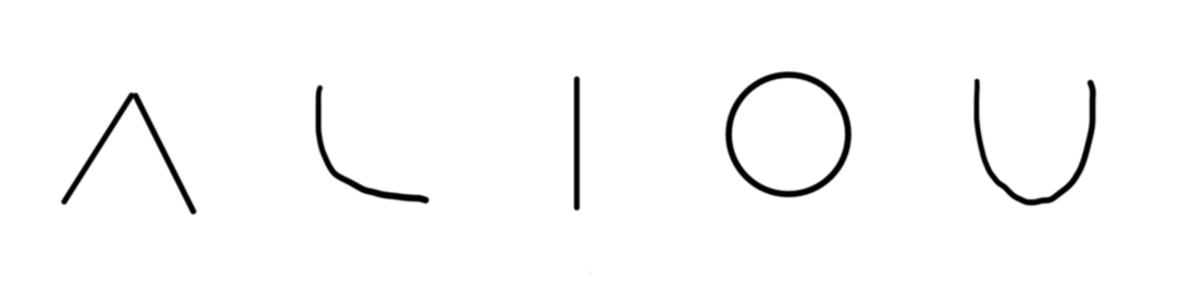
There are five core shapes, which each depict a vowel. They are as follows:
- Pointy half circle
- Quarter circle
- Short line
- Circle
- Half circle
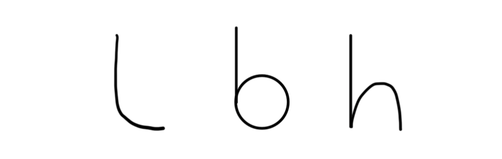
Stemmed Cores
Three of these have stemmed variants, made from combining the “short line” shape with one of the circle shapes.
- Stemmed quarter circle
- Stemmed circle
- Stemmed half circle
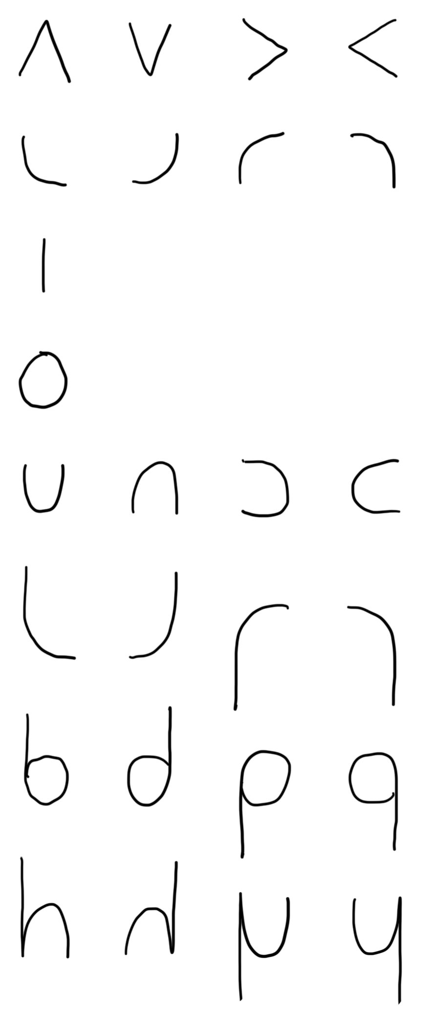
Axial Rotations
The core shapes (except short line and circle) are rotated to each cardinal direction, so that each forms a quad. Similarly, each of the stemmed letters are be flipped to make a quad. These six quads, plus the short line and circle make the 24 glyphs for the alphabet.
In the next image, each core/stemmed letter is on the far left, followed by the rest of the quad that it makes.
Notes on Specific Letter Choices
Each of these 24 glyphs needs to be assigned to a letter. The glyphs are shown below in alphabetical order. Many of the choices I made should be quite obvious, and I’ve added some justification for the rest.
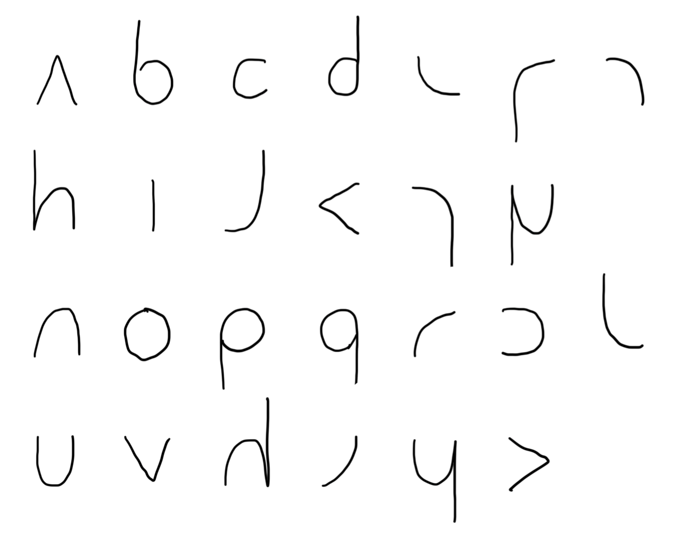
Elooks like the lower tail of the lowercase eGlooks like the ‘hook’ part of the uppercase GFis an uncrossed fKis the angled part of the k. Also, looks like a ‘pointy’ cLhas a top serif, as in many monospaced fonts. This was particularly tricky, since it is so similar to the uncrossed t (see next section for thoughts on base-height)Mlooks like the greek letter muSis a reverse c. Also it looks like the bottom half of an STis an uncrossed lowercase tWis a flipped-over M (to be fair, this was one of the last letters to be assigned, and kinda got what was left)Xis an uncrossed xZis a ‘pointy’ s
Variations
The group of stemmed quarter circles (FLTJ) presents an interesting choice regarding the position of the letters relative to the baseline.
The two main options are presented in the next image.
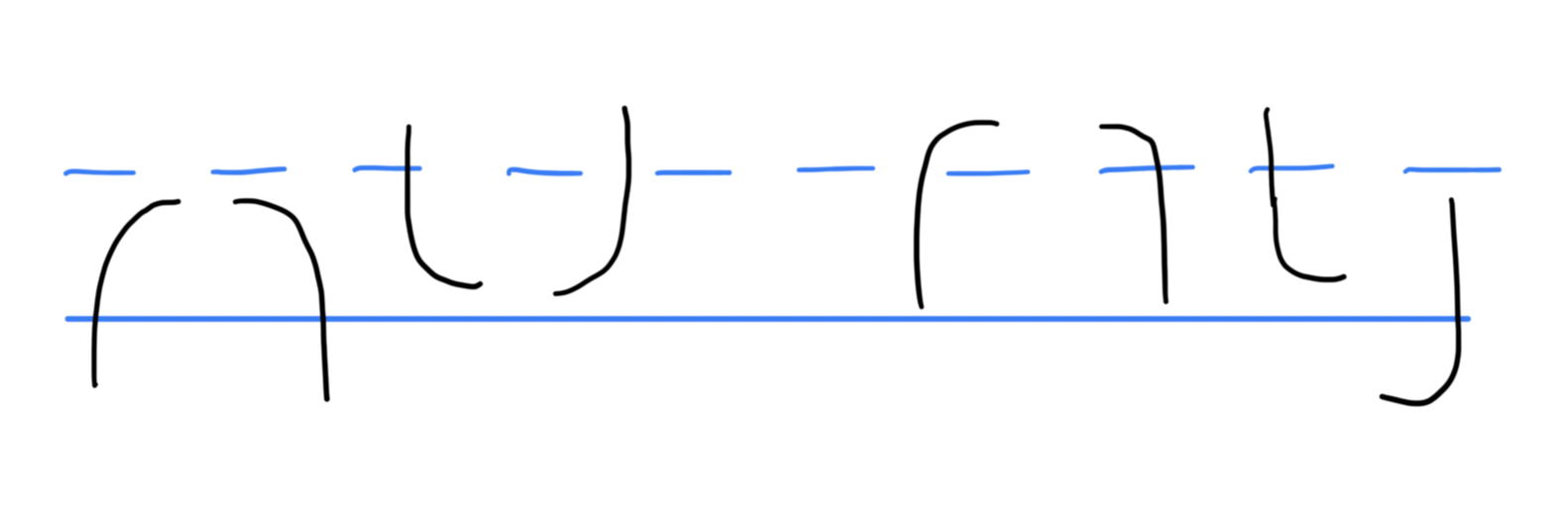
I think the left group looks better, because it puts all the core symbols between the baseline and the x-height, with only the stems ascending or descending. However, the right group more closely resembles the traditional letters. I think both are valid choices, but have used the left group in the examples because it matches the rest of the aesthetic.
Next Steps
While this is primarily intended for handwriting, it could be neat to have a font file for it. I have never created a font and don’t even know where to begin! But it could be something to explore. Since the shapes are so repeated, there would not me much to design or draw.
I mentioned at the start that I did not consider any uppercase letters. It would be interesting to explore how that fits into the concise and simple system. Maybe each uppercase is just larger than the lowercase letters? I don’t know, but there’s room to explore here.